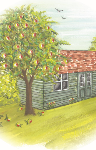
This website gallery contains a random but chronological order of pictures I have produced since I started painting, it will give you an idea of how I have developed over the years. I have been told this chapter of my website is very self-critical of my work, but this is about looking at mistakes I have made along the way and how I have developed, so it will be a tad self- effacing.
My advice to all painters is not to throw away your paintings but sign them, date them and keep them (unless you are lucky enough to sell them), this will then act to chart your progress over the months and years.
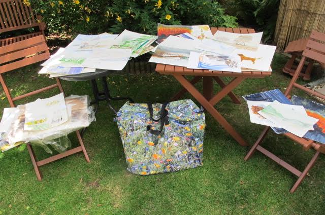
Even though I have hundreds of paintings and drawings in my archive they do not take up that much room as you can see by the photograph of all my paintings laid out on a table and others contained in that rather flashy ‘bag for life’ bag.
Photo 1 – 2007
This is a photo of one of the first pictures I painted back in 2007, it depicts all the hallmarks of a beginner. It is small, I did not have the confidence to go big. The colours are insipid, the trees look like they are floating in air, there is limited shadows and so on. However, I wanted to paint and I knew I would paint and I have had years of enjoyment since this first painting and I have met lots of wonderful people as a result.
Photo 2 – 2007
Hmm, another insipid 2007 effort, I needed to be braver with the paint didn’t I? I needed to learn about colour, the three primary colours are red, blue and yellow. There are three secondary colours orange, green and violet, from here you can go almost anywhere. I needed to practice mixing colours but I didn’t, if I had I would have found it fun and quite therapeutic. Painters need to be braver with colour, remember, watercolour dries lighter when it has dried.
Photo 3 – 2008
I thought this was quite good at the time, but there are lots of very weak areas, I will let you identify them.
Photo 4 – 2009
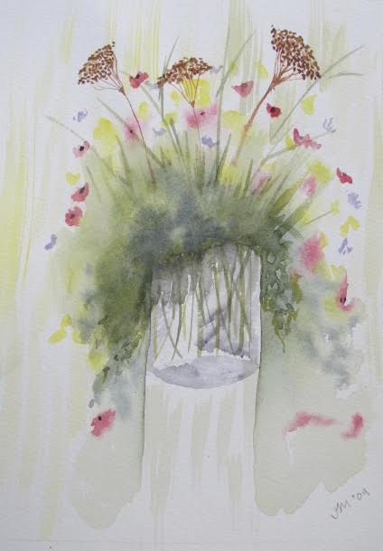
Some flowers. A foray into ‘wet on wet’ which resulted in making a green mud effect. I keeping banging on to students that nothing is just one colour but in this effort in 2008-9 the yellow is one yellow and the red is one red and all very lifeless. Adding different hues and tones to your painting will give it life and texture.
Photo 5 – 2009
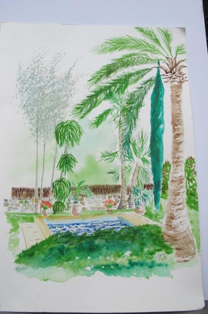
This is a picture of a beautiful garden in a wonderful little villa in Majorca. What I have done is very successfully ruined the look of the beautiful garden by weak use of paint (again) and where I use paint it is the wrong shade or hue, there are no shadows, there’s a green splurge in the foreground and perspective all wrong but other than that it’s a winner!!! We need to get things in perspective, here I am talking about painting not life itself! I’m OK on simple perspective where things get lighter as they go into the distance, things getting smaller as they move away from you, vanishing points and eye level and so on, but I still struggle when, say, a building has many bits added to it over the years and it has many different angles coming out of it , this is a thing I need to confront and overcome.
Photo 6 – 2009
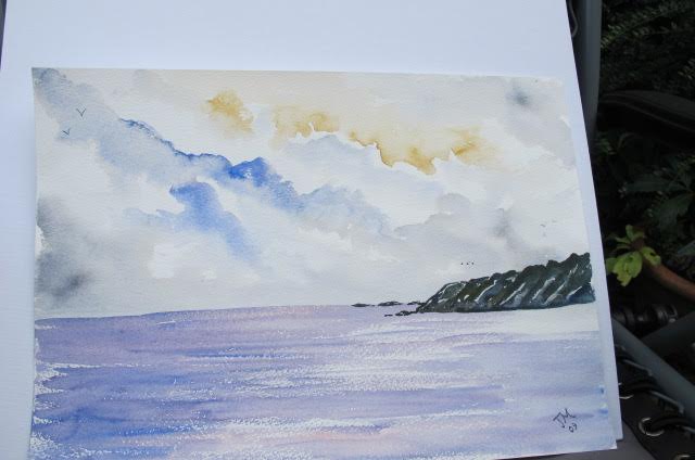
This picture shows some improvement. There is use of the ‘dry brush stroke’ technique on the sea, the cliffs are painted with a strong mix of paint and the sky has different colours in it, not that realistic but a definite improvement.
Photo 7 – 2010
This painting is copied from one of the thousands of art books on the market. It’s not too bad, but should be better, bearing mind I have now been painting for 3 years. However, that said, I was not painting everyday, it was quite sporadic, sometimes not picking up a paint brush for weeks or months, I had a day job at the time!!
Photo 8 – 2010
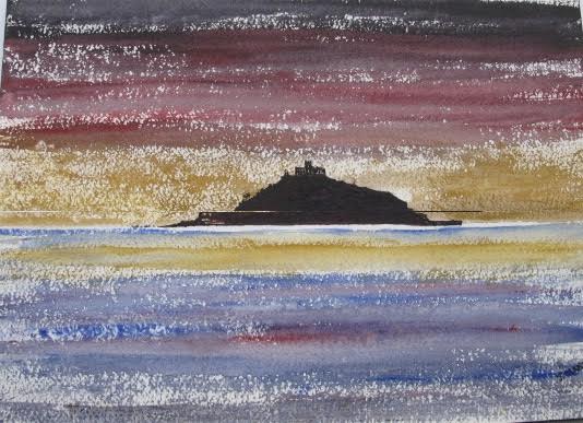
A silhouette image of St Michaels Mount near St Ives. I have experimented with stronger colour and really gone for dry brush strokes giving the effect that light is shimmering on the water and also in the sky. Silhouettes are a great way of producing paintings without needing to concern yourself too much about colour and detail and they can be very effective.
Photo 9 – 2011
This was an effort at painting Avon Gorge and the Clifton Suspension Bridge. I was obviously not in the mood and it was rubbish paper. I always encourage students to persevere with their painting but I just gave up and probably went to the pub! The learning point here is that we cannot always be in the mood for painting and sometimes things will just not go in our favour so perhaps it is better to put down our brushes and come back another day. A very bad day at the office!!!!
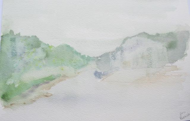
Photo 10 – 2011
This is another attempt at capturing a bit of Majorca but I have gone backwards and at quite a speed too. The colours are insipid, there is a lack of tonal value and all rather bland really.
Photo 11 – 2012
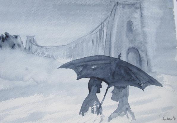
Another attempt at using silhouettes to create a picture, this time of the iconic Clifton Suspension Bridge using one of my favourite colours, Paynes grey and a ‘wet-on-wet’ technique. In the foreground are a couple keeping the sun off them, I say that because I cant see any rain can you? Also, it appears that young people had very pronounced chins in those day!!!! It is an OK ish painting but definitely not a good painting. I think the lady has grown a beard since I painted this!
Photo 12 – 2012
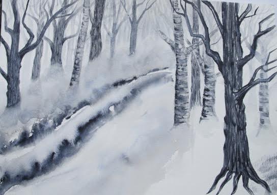
A woodland scene straight out of my head , I think it really should have stayed there. I tried to create an eerie scene with mist and and dark, silhouetted trees with some more wet-on-wet. You can see I have tried to get the bark looking like bark but think I am barking up the wrong tree (how sad is that pun!!!). And just look at the roots at the base of the trunk, how bad is that?
Photo 13 – 2012
This is me dabbling with acrylic, I think the less said the better.
Photo 14 – 2013
A little snow scene which is OK but the clothing the little figures are wearing is a bit garish and as usual the bloody dog has run off and nowhere to be seen. I am embarrassed to say that I put this in an arts trail exhibition and put £35 on it, what was I thinking. I am pleased to say that my students are doing far better than this and should quite rightly be putting their work in exhibitions and charging good money. An important point to remember is not to get despondent if you exhibit paintings for sale and no one buys one, it does not mean the painting is not any good, it just means that the buyer is not around to buy it. I recall putting the same picture in a market on several occasions and it did not sell and then suddenly a person was there in front me, liked the painting and paid the asking price.
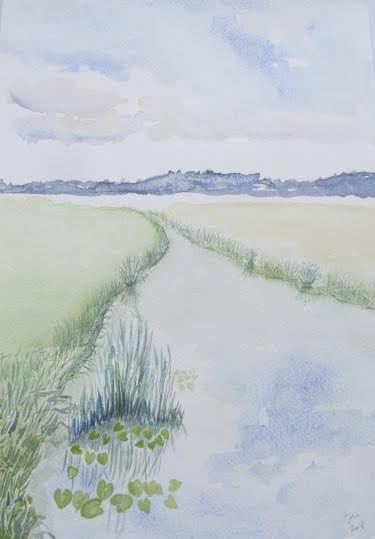
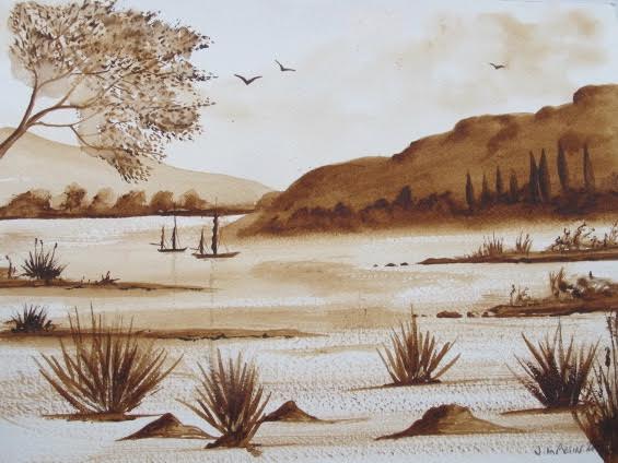
Photo 15 – 2014
It appears my development is now in reverse and all a bit demotivating really but oddly enough I am still enjoying painting and I knew I would improve, which is a bit obvious …. could I get much worse? I mean, look at those birds and the roots on the trees and the herbaceous border on the river bank, what was that all about? I am now about seven years into my hobby but not putting the time or effort into improving so what can I expect?
Photo 16 – 2015
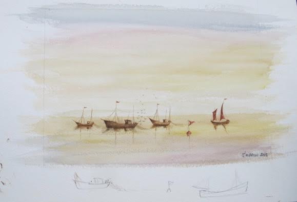
A simple little fishing scene copied from a book. Colours are still a bit weak but sky has graduated colours, the boats are in perspective, there is shade where shade should be, all the flags are flying in the same direction and the sea is a bit darker than the sky, I recall being quite pleased with this effort especially when I put a mount around it, it changes the look of the picture (to the good) immensely. Note the little practise sketches at the bottom of the picture which would be covered by the mount.
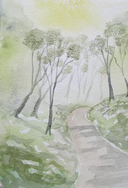
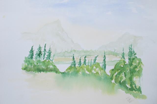
Photo 17 – 2015
This is an experiment in tonal painting. The techniques I have attempted to use is ‘wet-on-wet’, ‘dry brush strokes’, a bit of pointillism with the leaves on the trees and an eye to perspective with the distant hill being lighter than the close one. The birds are looking a bit more like birds rather than a ‘V’ sign written in the sky. Tones within a painting can create a focal point where light meets dark and can provide a three dimensional effect to your image. Knowing how to decide on the tonal value of your painting will also assist with perspective so practice it and then practice it again!!
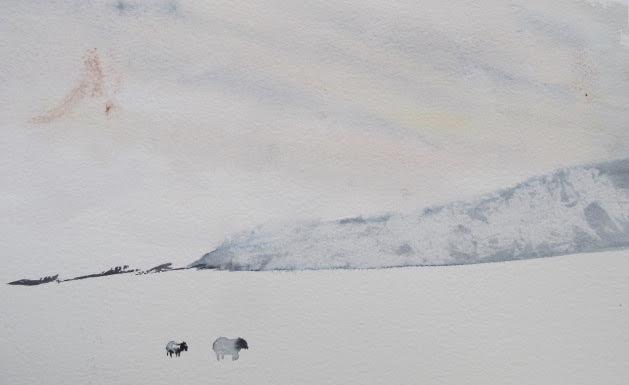
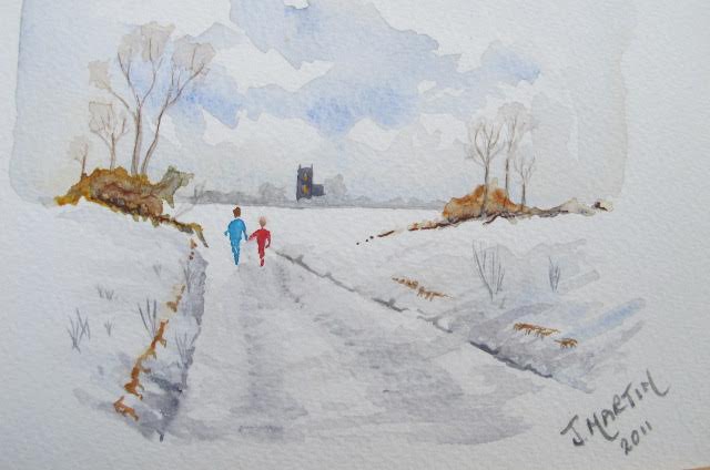
Photo 18 – 2015
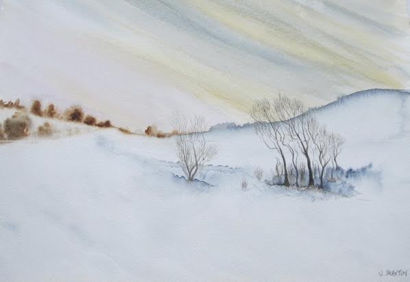
This is a little snow scene but I have left something out, I have left out a few sheep that featured in the original. The reason I left them out is because I did not want to spoil what I had already done, I didn’t have the confidence to paint them in. However, I did manage to spoil the picture because I did not put something in it that should be there. If you fear putting something in a picture because you might spoil it then practice what you fear on a separate piece of paper until you become proficient at it, and hey presto, no fear and no spoilt painting!!!!
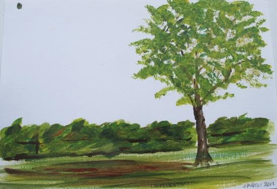
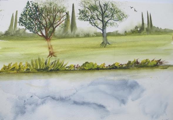
Photo 19 – 2016
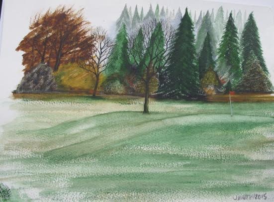
This is a golf course scene with much richer colouring, different shades of grass, fir trees that look almost like fir trees and deciduous trees that look almost like deciduous trees and a splash of red and orange for effect.
Photo 20 – 2016
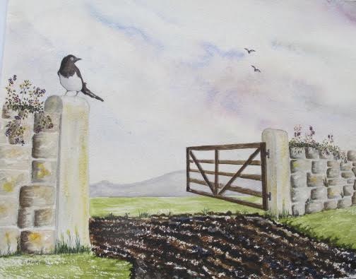
This is a picture of the biggest magpie in the world!!!! There are lots of other things wrong with it too, it just does not work. I am still not putting the hours in although I want to be, but the day job and other stuff keep getting in the way.
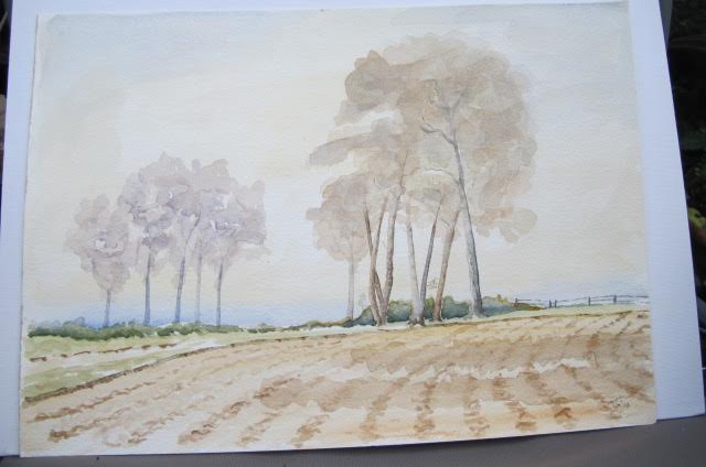
Photo 21 – 2016
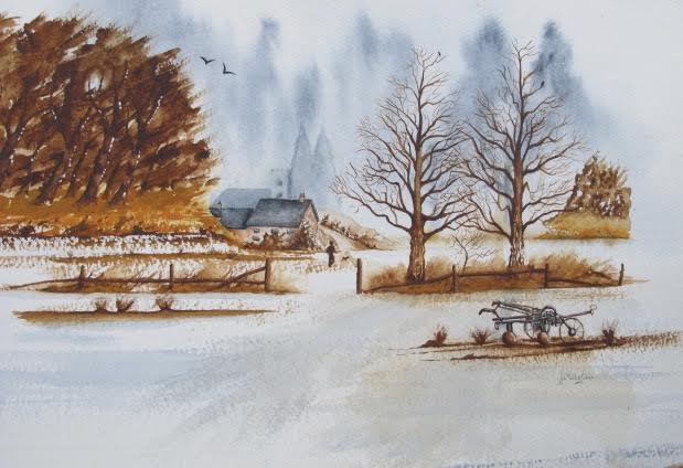
A semi tonal painting complete with latest plough on the market with all the technical advances of the time! Please note that the bloke walking has got his dog back, looks like Rover is on a long lead now. In order to get the dimensions of the plough right I traced it, just the main bits. Do not be afraid to trace, some of our greatest painters traced things and used something called camera obscura, which is a series of optics and lenses. David Hockney did some research which led him to believe that artists such as Caravaggio, Velázquez, da Vinci, and other hyperrealist actually used optics and lenses to create their masterpieces., so, if it’s good enough for them it’s good enough for me!!!!
Photo 22 – 2017
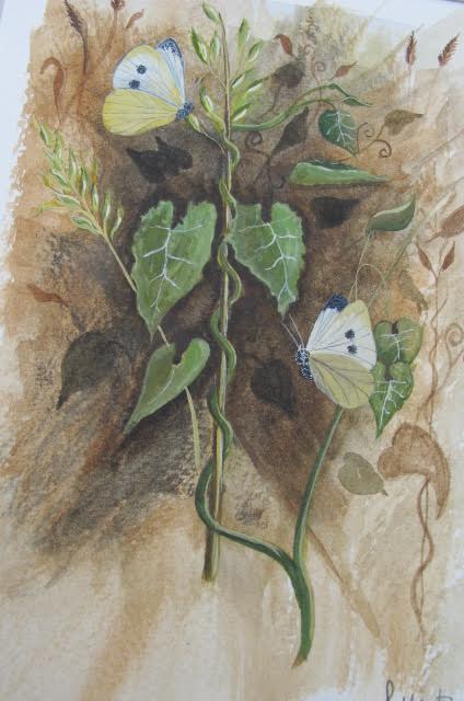
I started painting butterflies a couple or three years ago and I think I am getting quite good at them. This is a picture of a couple of large white butterflies and some ivy. I have done a series of these pictures and they are based on the style of Gordon Beningfield who is cracking at painting butterflies and flowers and almost anything else connected with nature and our landscape (check him out).
Photo 23 – 2018
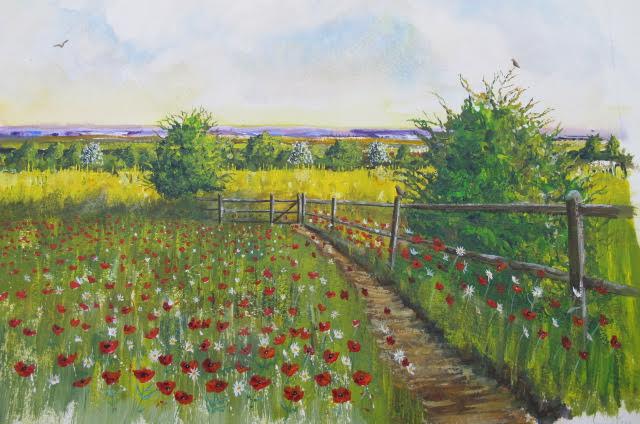
This is an acrylic painting of a path leading to a meadow. I am just starting to experiment with acrylic (all the other paintings featured here being watercolour) and it is a good medium to work with and I enjoy it.